The test itself is part of the following function:
compareMWT = function(x, y, test_title, alternative='two.sided') {
  wilcoxTest_result <- wilcox.test(x,y,
                        alternative=alternative,conf.int=TRUE)
  cat('Mann-Whitney test results for',test_title,"\n",sep=' ')
  if (wilcoxTest_result$p.value < 0.05) {
      cat('The H0 is rejected as p < 0.05,
              the HA accepted (medians unequal)',"\n")
  } else {
      cat('The HA is rejected as p >= 0.05,
              the H0 accepted (medians equal)',"\n")
  }
  print(wilcoxTest_result)
}
Our data includes Magn_prec00, Magn_prec50, Magn_prec70 and similar variables as data to be compared. The month_list is month names vector. Test is called in cycle (12 months) for the desired combinations (pairs) of variables. Test results are stored in two matrices: one for binary output (the H0 is coded as 0 and the HA as 1), and another matrix is to store the estimation of centrality shift.
# true-false H0 vs. HA matrices
MWU_prec_RCP45_matrix <- matrix(nrow = 12, ncol = 3)

# location shift estimation matrices
MWU_prec_RCP45_matrix_s <- matrix(nrow = 12, ncol = 3)

for (i in 1:12) {
  my_test1 <- compareMWT(Magn_prec00[,i],Magn_prec50[,i],
    paste(month_list[i],'precipitation: actual vs. RCP4.5 2050'))
  my_test2 <- compareMWT(Magn_prec50[,i],Magn_prec70[,i],
    paste(month_list[i],'precipitation: RCP4.5 2050 vs. RCP4.5 2070'))
  my_test3 <- compareMWT(Magn_prec00[,i],Magn_prec70[,i],
    paste(month_list[i],'precipitation: actual vs. RCP4.5 2070'))

  if (my_test1$p.value < 0.05) {
    MWU_prec_RCP45_matrix[i,1] <- 1
    MWU_prec_RCP45_matrix_s[i,1] <- my_test1$estimate
  } else {
    MWU_prec_RCP45_matrix[i,1] <- 0
  }
  if (my_test2$p.value < 0.05) {
    MWU_prec_RCP45_matrix[i,2] <- 1
    MWU_prec_RCP45_matrix_s[i,2] <- my_test2$estimate
  } else {
    MWU_prec_RCP45_matrix[i,2] <- 0
  }
  if (my_test3$p.value < 0.05) {
    MWU_prec_RCP45_matrix[i,3] <- 1
    MWU_prec_RCP45_matrix_s[i,3] <- my_test3$estimate
  } else {
    MWU_prec_RCP45_matrix[i,3] <- 0
  }
}
The visualization in pheatmap is nice, but the labels of the x-axis are oriented 270° by default, to override this strange feature we use custom function, identical to draw_columns internal function of pheatmap, except the rotation rot = 90 and ajustment hjust = 1. The override works within session by assignInNamespace.
library(pheatmap)

draw_colnames_90 <- function(coln, gaps, ...) {
    coord = pheatmap:::find_coordinates(length(coln), gaps)
    x = coord$coord - 0.5 * coord$size
    res = grid:::textGrob(coln, x = x,
          y = grid:::unit(1, "npc") - grid:::unit(3, "bigpts"),
          vjust = 0.5, hjust = 1, rot = 90, gp = grid:::gpar(...))
    return(res)
}

assignInNamespace(x="draw_colnames",
          value="draw_colnames_90", ns=asNamespace("pheatmap"))
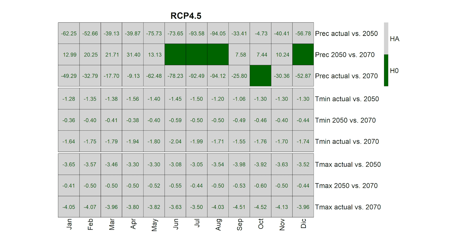
The visualization itself inslude dark green cells for cases where the H0 is acepted (no significant difference in medians), and light gray cells for cases of alternative hypothesis HA. The numbers within cells indicate the estimated median shift.
MWU_prec_RCP45_matrix_s <- format(MWU_prec_RCP45_matrix_s,
                                        digits=2, nsmall=2)
MWU_tmin_RCP45_matrix_s <- format(MWU_tmin_RCP45_matrix_s,
                                        digits=2, nsmall=2)
MWU_tmax_RCP45_matrix_s <- format(MWU_tmax_RCP45_matrix_s,
                                        digits=2, nsmall=2)

pheatmap(rbind(t(MWU_prec_RCP45_matrix),
               t(MWU_tmin_RCP45_matrix),
               t(MWU_tmax_RCP45_matrix)),
         display_numbers = rbind(
               t(MWU_prec_RCP45_matrix_s),
               t(MWU_tmin_RCP45_matrix_s),
               t(MWU_tmax_RCP45_matrix_s)),
         fontsize_number = 13,
         number_color = 'darkgreen',
         color = c('darkgreen','lightgray'),
         border_color = 'black',
         cellwidth = 50, cellheight = 50,
         symm = FALSE,
         cluster_rows = FALSE,
         cluster_cols = FALSE,
         gaps_row = c(3,6),
         legend_breaks = c(0,0.25,0.5,0.75,1),
         legend_labels = c('','H0','','HA',''),
         labels_col = month_list,
         labels_row = c('Prec actual vs. 2050',
          'Prec 2050 vs. 2070','Prec actual vs. 2070',
                        'Tmin actual vs. 2050',
          'Tmin 2050 vs. 2070','Tmin actual vs. 2070',
                        'Tmax actual vs. 2050',
          'Tmax 2050 vs. 2070','Tmax actual vs. 2070'),
         main = 'RCP4.5', fontsize = 16)
.
Читать дальше......

